Scalable Product Detail Page System
Designing a consistent shopping experience for wine and digital gifts.
Sommsation’s product pages needed to support different purchasing decisions within one marketplace. I redesigned the wine product detail page and designed a new digital gift-card experience, connecting product information, selection, and purchase actions through a consistent visual framework.

SOMMSATION · RESPONSIVE E-COMMERCE
Project Overview
-
Role: UI/UX Designer
-
Scope: Wine and digital gift-card product detail pages
-
Platform: Responsive web
Problems & Constraints
Different products, different buying decisions.
A wine purchase depends on understanding the bottle:
Its characteristics, price, and relevant purchase information. A digital gift card requires customers to choose a design and value, then provide the information needed to send their gift.
The challenge was to accommodate those differences while keeping both experiences recognizable as part of the same marketplace.
My Contribution
My UI design work covered the wine PDP redesign and the new digital gift-card page. I focused on information hierarchy, product-selection controls, responsive layouts, and the visual treatment of interaction states.
Across both experiences, I worked to maintain a consistent presentation while giving each product type the controls and information it needed.
Understanding the Existing Experience
The existing wine page provided a starting point for reconsidering how product information and purchase controls were organized.
The new gift-card page introduced a different task: configuring a personalized digital product.
I approached the work around two questions: what should customers understand first, and what should they be able to do next?


Original wine PDP
Early exploration
A shared structure with room for variation
Both pages needed a clear product introduction, selection controls, a primary purchase action, and supporting details.
I used those common needs to guide the page structure, then adapted the content and controls for wine and digital gifting.
How might we make different products feel part of one shopping experience?
1. Put product essentials first
For the wine PDP, I organized the product image, name, price, and purchase controls into a clear introduction.
Supporting content followed below, giving customers a starting point for evaluating the bottle before exploring it in more detail.

2. Make supporting details easy to explore
Wine pages need to balance product storytelling with practical information. I organized supporting content into distinct sections so customers could explore the wine and winery without losing the hierarchy of the page.
Consistent headings, spacing, and disclosure treatments gave those details a predictable structure.

PDP main information
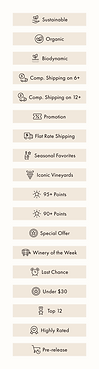
Badges & chips

Sommelier quote collapsed (default)


Highlights expanded (default)

Winery info expanded
Sommelier quote expanded

3. Guide customers through creating a digital gift
The digital gift-card page needed to support configuration as well as product information. I organized design selection, gift value, and recipient information into a clear sequence before customers added the gift card to their cart.
The page retained the marketplace’s visual language while introducing controls specific to gifting and connecting to the shared checkout experience.

Default

Value drop-down

Custom value

Filled state
(send now)


Different card design choice
Error state

Added to cart
Filled state
(send later)
4. Design beyond the default state
The gift-card experience also required attention to what happened as customers made selections and entered information.
I designed the form’s interaction states to keep selections visible and feedback connected to the relevant controls.
A consistent experience on smaller screens
I adapted both product pages for mobile, preserving the relationship between product information, selection controls, and the primary action.
The layouts adjusted to a single column while maintaining a consistent visual hierarchy across product types.


Added to cart
Wine PDP (default)
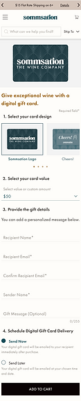

Added to cart
Wine PDP (default)
Shared patterns across product types
The wine and gift-card pages shared typography, spacing, control styling, and supporting-information patterns. Product-specific content and inputs fit within that common visual structure.
This approach connected the two experiences while allowing each page to support a different purchasing task.

Outcome
The project produced a redesigned wine PDP and a new digital gift-card experience, with responsive layouts and a consistent visual framework across both product types.
The designs brought together product information, selection, and purchase actions while accommodating the distinct requirements of wine and digital gifting.
Reflection
This project reinforced the importance of deciding what should stay consistent and what should change between product types. Shared visual patterns created continuity, while product-specific controls supported different purchasing decisions.